Interesting links
- Website_redesign_2009
- Top 10 Tasks www.fedoraproject.org Users Should Be Able to Do (see below at )
- Máirín Duffy - Fedora Website Design Ideas (old though)
- mizmo's mock-ups and sources (mizmo, is it okay if I link these here? :) )
Current www.fpo content
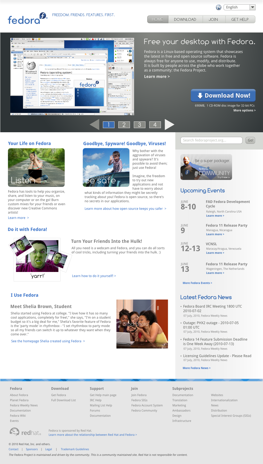
Header
The current header only contains the Fedora logo and slogan.
Body
- A simple text title, "Fedora 13: Rock It!"
- A big banner for F13, which links to the one page release notes.
- A links that says "What's new in Fedora 13? Read the release notes. >>". This one also links to the release notes, but the "real" ones.
- A small piece of text with a description of what Fedora is: Linux-based OS, latest in FOSS software, free to use/modify/spread, anyone is welcome to join, basically the regular "what is Fedora?" intro text. Link below it says "Learn more. >>" and links to Overview.
- A big light blue button "Download Now!", which links to get.fpo.
Sidebar
The sidebar contains several links, divided into parts:
- First, another F13 banner (smaller than the main banner but bigger than the download button) which links to get.fpo.
- "Navigation", with links to Home (greyed out, since you're already at Home), get.fpo, join.fpo and Get Help. Basically the most important pages you can go from here.
- "Tools", which has docs.fpo, a wiki link, a Planet link, a Communicate link and an Events link. All of these links have a little description.
- "Website language", with a dropdown menu to change your language.
- "Hosting Sponsor", with an InterNetX logo linking to http://www.internetx.com/.
The footer is still the old one and will be updated to match the new design seen on http://spins.fedoraproject.org/ and in this mock-up.
I think this is actually that part that needs the least change...
Review of current content
Alright, I think that's all the content on the current page. Now, what's up with it? What can we improve, what's missing, what should be left out?
Header
- The current header feels very... empty. White space is good and all, but we don't want to waste this important part of page real estate. What can we use it for?
- The logo could be more prominent?
- Like mizmo's mockup, we could use it...
- ...as the main navigation area
- ...to let visitors select their language (if you don't speak English, it's good to have it in a prominent position)
- ...to display a search bar, if that's needed
Sidebar
- I'm not entirely sure if we even *need* a sidebar? It's kind of old-fashioned and makes the page look wiki-like instead of a nice product presentation, imho. Also, instead of collecting all the links here we could spread them throughout the page and place them in relevant sections. Like in the mock-ups, maybe a very small navigation area at the top would be nice, since we have just a few links that NEED to be prominent (i.e., get.fpo, join.fpo, etc).
- There's multiple links that don't even need to be here. For instance, "Home" could be left out completely, since we're already there. And "Get Fedora" is the third link to get.fpo (you can already get there through the small banner or the "Download Now!" button.
- The links under "Tools" all have to do with the community. Except for "Docs" (the documentation), they are about the Wiki, the community Planet, Communication with the community (although this could also be seen as Help) and Events for the community.
- Create a seperate section for community links? Somewhere where Fedora contributors can find their stuff?
- What's with the hosting sponsor? Is this still valid? (I have no idea :) )
- The banner at the top is kind of double... We already have a huge banner, so why place another one here? It's the third link that goes to get.fpo.
Body
- Personally, I always like website designs that have the courage to place their product in full view, no holding back or covering it in marketing-speak. Therefore I really like the big banner. If we could place something like this (or even bigger?) in the middle of the page, featuring the latest release, I think it'd look great and show that we are confident and proud of our software. It would show the visitors immediately what this website is about and what it is.
- mizmo's mock-ups have a slideshow, which a lot of websites use. This could work and we could fill the first slide with a big FXX picture for the latest release, and use the rest to show additional features or big events. It could definitely be made very sleek and sexy.
- All the links need ordering... Currently there are three links to get.fpo, one to the release notes, one to the one-page release notes and one to the Overview. We should make it clear which links go where.
- The text below the banner is pretty good IMHO, just the regular "what's Fedora?" blurb. Explain what is it, what it does and who makes it. Also notes that anyone can join. Maybe we could make this more prominent, though? Place it near or on the banner, or make it a little bigger... The "Learn more" link below it is definitely good, links to Overview, which is exactly what you would expect if you wanted more information about the Fedora Project.
- I love the big download button. Straight to the point!
- Could this be made even more direct, linking straight to the default ISO? (Don't know if this is okay technically/legally/infrastructurally :) ) If it does so, it should probably say something else to signify that it goes straight to the file, and also show that there are plenty of other options (mirrors/torrents, other versions, 32/64 bit, languages, spins, etc...).
- The body page is also quite empty. On one hand, clean and simple designs can work, but there's so much more to tell about the Fedora Project (which resulted in the links in the sidebar). So on the other hand, we could make it *the* hub for all things Fedora. Sure, you can just download it. But you could also show additional features (WHY should you choose Fedora?), show what's going on in the community, show that (and how!) you can join us, show more information about why open source is awesome, etc etc. Right now it's sort of half-way between these two options (not that that is necessarily something bad).
As said above, this will probably be changed to match the new design seen on http://spins.fedoraproject.org/ and in this mock-up.
- IMHO, the new footer design looks awesome! For what's essentially a bland collection of links, it looks professional yet beautiful. Is obviously there, but still doesn't attract everyone's attention, which I think is a good thing.
What others are doing
Looks like a webshop. Which I guess, it is. :)
Recently got a redesign. Big, prominent slideshow. Main menu, logo, search at the top. Below slideshow: tour of different Ubuntu types, big "Download" button similar to current Fedora website. In the body: a prominent explanation of what Ubuntu is, with links to "open source" and "the Ubuntu Project". Below this, three big sections for "Join the community", "Get support" and "Find a partner"
A blog-style website. Also features a slideshow and the main menu at the top. Three slightly bigger buttons to the right of the slideshow with "Donate", "Participate" and "Download". Like many blogs: content down the main column, right column used for adds and a Download banner.
Big, prominent display of the product, yet not a slideshow: it's one static image. Also main menu at the top, with sections like "What's New", "What is Mac OS X?" and "Developers". Next to the main menu, a small "Buy Now" button. Below the main picture there are a 4 big sections showing OS X features and introductions. Below that, a banner with links to Snow Leopard buying and info and another small "Buy Now" button. That's it.
Top 10 Tasks www.fedoraproject.org Users Should Be Able to Do
So, digging around I found this older document, Top 10 Tasks www.fedoraproject.org Users Should Be Able to Do which is really interesting. Let's see the Top 10 Tasks:
- In one click, download the x86 Live Media ISO image
- Get access to support oriented towards NEW users.
- What Is Fedora / What the project is all about.
- Join Fedora (that's always important :-))
- What kinds of things can you DO with Fedora
- What's new/happening in fedora, right now (community? news?)
- Support Fedora
- Download other Fedora forms
- Fedora bling
- Developer's Corner